
Local optimism of The Three Crowns brand
Meet The Three Crowns Brewery product range rebrand - awarded with 2018 DESIGN Golden Arrow Nomination.
Our collaboration with The Three Crowns Brewery began with analysis of the brands heritage, deeply incorporated into local tradition, legend and storytelling. Hand in hand with our client we took off onto an inspiring journey to seek for brand's origins and potential and present it in a modern shape. We had three key stops: passionate communication strategy, complex brand identity and packaging design. Our discoveries resulted in 2018 Golden Arrow nominations.
Let us tell you a story on how to create a true, conscious local ambassador and outline his optimistic, curious and cheerful nature, without a dip of mockery.
The Three Crowns Brewery first showed us its potential during the inspirational workshops, where basic brand principles and visual language where established. Brands aspirations and parallel competition activities helped us to shape its DNA, which quickly became a foundation of future communication. Brand Identity Manual present key values of the brand, which help define brand's personality on the market.
Challenge 1:
Brand identity close to nature

Challenge 1:
Brand identity close to nature
Rooting in local tradition and heritage, The Three Crowns Brewery remains independent of forward-thinking. Legendary, mythical heroes of the region were brought to life using attractive narration straight from the Polish highlands.
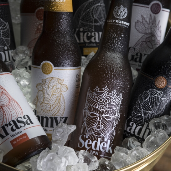
Each product became a separate hero ambassador, so close to local inhabitants (positive heroes in white labels, black characters in dark labels). Key historical figure was based around Sędek, a local knight of strong and independent character.
Connecting tradition with modernity is clearly represented in the trade mark. The logo is both minimalist, yet historical. Built on sign and name of the brand it represents the shape of the Three Crowns peak arising from the hop leaf. The name is enriched with local place of origin of the product.
Challenge 2:
Marrying tradition with modernity
Challenge 2:
Marrying tradition with modernity
Main visual motive is based on traditional figures of brand heroes. Each product has a different feel to it, making them individual and original, to engage consumers and provoke them to search for their favourite taste.
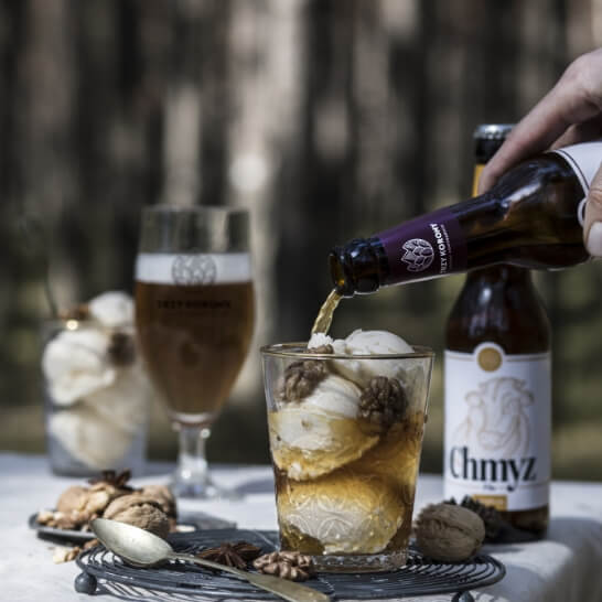
Packaging gave us wings! Each bottle stands out among local craft breweries and its slim shape lays mildly in hand. Labels tell stories of the brand and its heroes. The mark becomes a stamp expanding the label, which makes it more visible. The reverse of the label continues to engage the consumer in brands heritage. The final design has been gently wrapped around the bottle thanks to screen print.
Challenge 3:
Building an impactful product
Challenge 3:
Building an impactful product
Masterful digital transformation of Volkswagen Aftersales services
See how a single aftersales campaign generates over 100k views!
Read moreAdditional case studies
Discover even more creative branding, marketing and communication projects we had the pleasure to work on over the years.
Ready for work?
Reach out to us and find out how can we expand your business.
ul. Saperska 42c/12, 61-493 Poznań, Poland
office@riverwood.pl
ul. Saperska 42c/12, 61-493 Poznań, Poland
office@riverwood.pl